
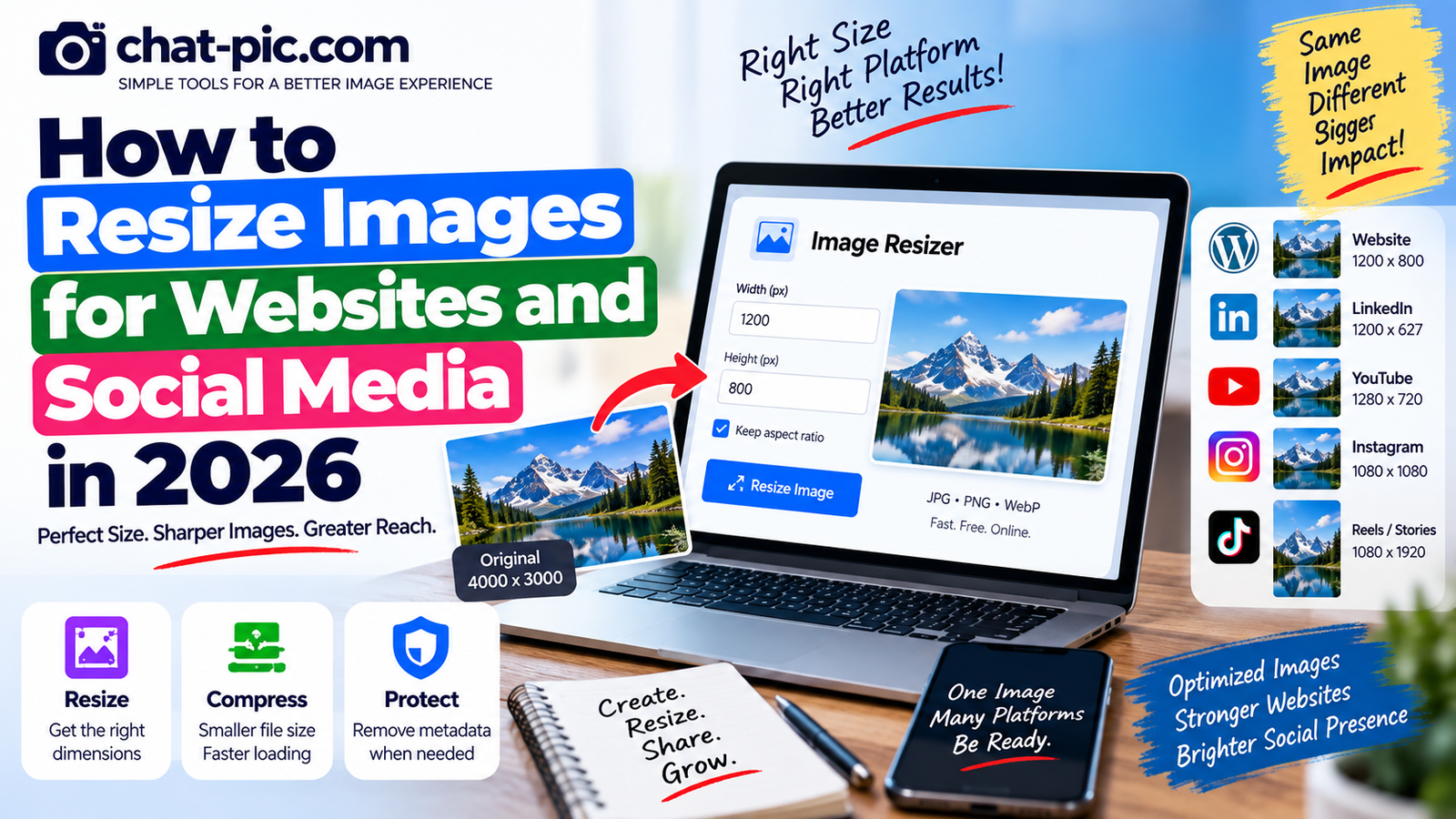
Uploading the same full-size photo everywhere is rarely the best approach.
A photograph taken on a modern phone may be 4,000 or 6,000 pixels wide, while a website article might display it at only 1,200 pixels. Social platforms also use different shapes for feed posts, vertical content, link previews, banners and thumbnails.
If you know how to resize images for websites and social media, you can make images load faster, fit layouts correctly and avoid blurry, stretched or badly cropped results. A simple workflow makes it easier to resize images for websites and social media without stretching or losing clarity.
The goal is not simply to make every image smaller.
The goal is to create the right-sized copy for where the image will actually appear.
What Does Image Resizing Mean?
Image resizing changes the pixel dimensions of an image.
For example:
- Original:
4000 × 3000 - Resized copy:
1200 × 900
The photograph keeps the same general shape, but contains fewer pixels.
This is different from compression.
Resizing changes width and height.
Compression changes how efficiently image data is stored.
For many website images, the best workflow is:
Resize first → compress second.
Use the Chat Pic Image Resizer
For a simple browser-based method, use the:
Chat Pic Image Resizerhttps://chat-pic.com/image-resizer/
Upload your image, enter the width or height you need and keep original aspect ratio enabled unless you intentionally want a different shape.
The tool can create JPG, PNG or WebP output.
Keep your original photograph separately and use the resized version for publishing or sharing.
Why You Should Not Upload Huge Images to a Website
Suppose a WordPress article displays an image at around 1,000 pixels wide.
Uploading a 6,000-pixel original can force the visitor to download much more image data than the layout actually requires.
Large images can:
- Increase page weight
- Use more mobile data
- Take longer to download
- Consume unnecessary storage
- Slow the first visual experience
Google recommends responsive images and image optimization because images are often a major contributor to page size. It also recommends using srcset or <picture> so browsers can select an appropriate image for different screens.
Best Image Width for Website Articles
There is no single perfect width for every website.
The correct size depends on your content container and theme.
For many normal blogs, a practical content image might be somewhere around:
- 800–1200 px wide for regular article images
- 1200–1600 px wide for large feature images
- Smaller dimensions for icons, thumbnails or cards
Do not treat these as strict Google requirements.
Your actual WordPress layout should determine the dimensions.
If the content column never displays an image above 900 pixels, uploading a 5000-pixel copy usually provides little benefit.
A Good Size for Google Discover Images
For articles you hope may appear in Google Discover, image quality matters.
Google currently recommends compelling, high-quality images that are at least 1200 pixels wide and above 300,000 total pixels. It also highlights landscape-friendly imagery and recommends enabling large image previews.
For Chat Pic feature images, a strong practical approach is:
At least 1200 px wide
This also gives you enough resolution for attractive article previews.
Do Not Stretch an Image
One of the easiest ways to ruin a photograph is to change its width without changing its height proportionally.
Imagine an original image measuring:
1600 × 900
This is a 16:9 image.
If you resize it to:
800 × 450
the shape stays correct.
But if you force it to:
800 × 800
without cropping, people and objects may become stretched.
That is why the Keep original aspect ratio option in the Chat Pic Image Resizer is useful.
When enabled, changing one dimension automatically calculates the other.
What Is Aspect Ratio?
Aspect ratio describes the relationship between width and height.
Common examples include:
| Ratio | Common Use |
|---|---|
| 1:1 | Square social images |
| 4:5 | Portrait feed images |
| 16:9 | Website banners, YouTube and landscape media |
| 9:16 | Stories, Reels and vertical content |
| 1.91:1 | Link previews and wide social images |
Two images can have different dimensions while using the same aspect ratio.
For example:
1920 × 1080
and
1280 × 720
are both 16:9.
Resizing vs Cropping
Resizing and cropping are not the same thing.
Resizing
Changes the overall number of pixels while keeping the whole image.
Cropping
Removes part of the image to create a different composition or aspect ratio.
If you have a landscape photo but need a vertical social post, simply resizing will not turn it into a good vertical image.
You may need to crop it.
When cropping, keep faces, text and important objects away from the edges because platforms may display images differently across devices.
Best Image Size for WordPress Feature Images
WordPress itself does not require one universal feature-image dimension because themes use different layouts.
For a site such as Chat Pic, a landscape feature image around:
1200–1600 px wide
is generally practical.
Your current feature images are wide banner-style graphics, so maintaining a consistent landscape ratio will make the article archive look more professional.
Consistency is often more important than chasing a specific pixel number.
Resize Before Compressing
If the original photograph is far larger than necessary, resizing can reduce file size dramatically before you even adjust compression quality.
For example:
A 5000 × 3500 photo contains over 17 million pixels.
A 1200 × 840 copy contains roughly 1 million pixels.
You are removing a huge amount of image data that the website might never display anyway.
After resizing, use the:
Chat Pic Image Compressorhttps://chat-pic.com/image-compressor/
This can reduce the file size further.
Social Media Images Need Different Shapes
One reason people struggle with social graphics is that there is no single image dimension that fits every placement perfectly.
A square feed image, landscape article preview and vertical Reel all have different shapes.
Instead of creating one image and forcing it everywhere, keep a master design and export separate copies.
For example:
- Square copy
- Portrait copy
- Landscape copy
- Vertical copy
This gives you much more control over text placement and cropping.
LinkedIn Photo Sizes in 2026
LinkedIn’s current guidance recommends photos at least 552 × 276 pixels, with 1080 pixels wide recommended for better quality. Normal photo posts support aspect ratios ranging from 3:1 to 4:5.
For most normal LinkedIn posts, you can therefore safely start with:
1080 px wide
and choose the shape based on your content.
For a portrait-style feed image, 4:5 can provide more vertical screen space.
For a landscape graphic, use a wider ratio.
LinkedIn link preview images
LinkedIn recommends approximately:
1200 × 627 pixels
with a 1.91:1 ratio for website link preview images.
This is useful if you are designing an Open Graph image specifically for an article.
LinkedIn Company Page Images
Different parts of LinkedIn use different dimensions.
For example, LinkedIn currently recommends a Company Page logo of 400 × 400 pixels, while company cover imagery uses a much wider layout. LinkedIn also warns that cover images may be cropped on different screens, so important details should remain away from the edges.
This illustrates an important rule:
Do not assume one “LinkedIn size” works everywhere.
Feed posts, link previews, company banners and logos are separate placements.
YouTube Thumbnail Size
YouTube uses a landscape video-player format.
Its standard desktop video aspect ratio is 16:9, and common HD dimensions include 1280 × 720 and 1920 × 1080.
YouTube’s Thumbnail Test & Compare documentation also uses 1280 × 720 as the 720p threshold for thumbnail experiments.
So for a normal YouTube thumbnail, a reliable template is:
1280 × 720 pixels
This provides the familiar 16:9 shape.
Keep important text large because thumbnails are often displayed very small on phones.
Vertical Content: Reels and Stories
Vertical short-form content is designed primarily for phones.
Meta currently emphasizes 9:16 vertical creative for Instagram and Facebook Reels and recommends keeping important creative elements inside the safe area so interface elements do not cover them.
A common full-HD vertical canvas is:
1080 × 1920
This is a 9:16 ratio.
Even when you are using a still image rather than video, designing on a vertical canvas gives you much better control than stretching a horizontal photograph.
Square Social Images
Square images remain useful because they adapt reasonably well to many feed-style layouts.
A common high-quality square export is:
1080 × 1080
A square design is useful for:
- Quote graphics
- Product images
- Simple announcements
- Photo cards
- General social posts
However, a square image does not take up as much vertical screen space as a portrait post on a phone.
If mobile feed visibility is important, a portrait layout may be more effective.
Portrait Feed Images
A popular portrait shape is:
4:5
For example:
1080 × 1350
The benefit is simple:
A portrait image occupies more vertical screen space than a square or landscape image.
LinkedIn currently supports photo post ratios up to 4:5.
For other networks, always preview the post because rendering rules can change.
Why You Should Leave Space Around Text
Never place critical words directly at the edge of a social image.
Platforms may:
- Crop previews
- Overlay buttons
- Add profile elements
- Display the image differently on phones and desktops
LinkedIn explicitly warns that cover images can be trimmed depending on screen size and recommends keeping key information away from the edges.
The same design principle is useful across social platforms.
Keep the important subject and headline closer to the visual center.
Resize Photos for Facebook and Instagram Carefully
Facebook and Instagram can display images across many different placements.
Feed posts, profile images, stories, reels and ads do not all use the same shape.
Instead of trying to memorize one universal dimension, build around the intended placement.
For example:
Feed: square or portrait
Stories/Reels: 9:16 vertical
Wide previews: landscape
Meta specifically recommends native 9:16 creative for Reels.
Always preview before publishing because interface layouts can change.
How to Resize an Image for a Website
A simple workflow is:
- Check how wide the image appears on your site.
- Keep the original file safely stored.
- Open the Chat Pic Image Resizer.
- Upload the photo.
- Keep aspect ratio enabled.
- Enter the required width.
- Export the resized copy.
- Compress it if needed.
- Upload the optimized copy to WordPress.
If you do not know your exact website width, 1200 px is a practical starting point for many article images, especially when you also want a strong image for sharing or Discover.
Best Ways to Resize Images for Websites and Social Media
First identify the placement.
Do you need:
- Square feed graphic?
- Portrait post?
- Landscape link preview?
- Vertical story?
- YouTube thumbnail?
Then create the correct aspect ratio.
Do not repeatedly resize the same small exported copy.
Work from your original or high-quality master whenever possible.
Never Enlarge a Small Image Too Much
Resizing downward generally works well.
Resizing upward is different.
If you take a 400 × 300 photo and enlarge it to 1600 × 1200, the software must create additional pixels from limited original information.
The result may look:
- Soft
- Pixelated
- Artificial
- Blurry
Whenever possible, start with an original that is at least as large as your required output.
High-DPI and Retina Screens
Modern screens can have high pixel density.
This is one reason very tiny images may appear soft even when their CSS display size looks correct.
For important logos or interface graphics, providing an image larger than the displayed CSS size can help maintain sharpness on high-density displays.
However, do not use this as an excuse to serve enormous camera originals.
Responsive image techniques can provide different image files depending on screen requirements.
Responsive Images Are Better Than One Giant Image
Websites are viewed on:
- Phones
- Tablets
- Laptops
- Large monitors
Serving the exact same giant image to every device is inefficient.
Modern HTML supports srcset and <picture>, allowing the browser to choose from different image sizes.
Google recommends these responsive-image approaches and advises always providing a fallback src image.
WordPress automatically creates multiple image sizes for many uploads, which can help themes deliver more appropriate files.
Image Formats After Resizing
Resizing is only one part of optimization.
You also need the right format.
JPG
Good for normal photographs.
PNG
Useful for screenshots, graphics and transparency.
WebP
Useful for both photos and many web graphics with efficient compression.
AVIF
A modern format supported by Google Search and major current browsers, although compatibility and workflow considerations can still matter. Google Search currently supports JPEG, PNG, WebP, SVG, AVIF and several other formats.
For simple everyday use, JPG and WebP remain convenient choices.
Remove Metadata Before Public Sharing
Resizing an image does not automatically guarantee that all original metadata has been removed.
If you are sharing a personal photograph publicly, create a privacy-cleaned copy first with:
Chat Pic EXIF Metadata Removerhttps://chat-pic.com/exif-metadata-remover/
This is especially useful for images taken at private locations.
Remember that metadata removal cannot hide information that is visibly present inside the photograph.
Image Resizing and SEO
Correctly sized images can contribute to better website performance, but image SEO involves more than dimensions.
Google recommends:
- High-quality relevant images
- Descriptive filenames
- Useful alt text
- Images near related text
- Responsive delivery
- Appropriate optimization for speed
For example, this filename:
image-resizing-social-media-2026.webp
is more descriptive than:
IMG_5729.webp
Alt text should explain what the image shows rather than stuffing keywords.
Do Not Keyword-Stuff Image Alt Text
Google explicitly recommends useful, information-rich alt text and warns against stuffing it with keywords.
Good example:
“Laptop showing an image resizing tool with width and height fields.”
Bad example:
“image resizer resize images photo resizer free image resize social media resize tool.”
Write alt text for humans first.
Good Image Sizes for Chat Pic Articles
For your own chat-pic.com site, a simple consistent system can be:
Feature images: around 1200–1600 px wide
Article screenshots: around 1000–1200 px wide
Small diagrams: only as large as they need to display clearly
Your generated feature images are landscape-oriented, which works well for a consistent article design.
Before uploading them, you can compress them if the file size is unnecessarily large.
Common Image Resizing Mistakes
Uploading camera originals directly
A 6000-pixel image is usually unnecessary for a normal blog article.
Turning off aspect ratio accidentally
This can stretch faces and objects.
Making small images much larger
Upscaling can create blur.
Repeatedly resizing the same copy
Keep a master original and create new exports from it.
Ignoring the final platform shape
A beautiful landscape image may be badly cropped in a vertical placement.
Putting text too close to edges
Platform UI or automatic cropping can hide it.
Using one file for every platform
Prepare different sizes when the placements have very different shapes.
Practical Size Cheat Sheet
These are useful working templates rather than universal rules:
| Use | Practical Starting Size |
|---|---|
| Blog feature image | 1200–1600 px wide |
| Google Discover-friendly landscape | At least 1200 px wide |
| LinkedIn photo post | 1080 px wide |
| LinkedIn link preview | 1200 × 627 |
| Square social image | 1080 × 1080 |
| Portrait social image | 1080 × 1350 |
| Reels/Stories vertical canvas | 1080 × 1920 |
| YouTube thumbnail | 1280 × 720 |
LinkedIn and Google specifications above are based on their current official guidance; other social placements should always be previewed because platforms can change their rendering.
A Better Workflow for Content Creators
If you create images regularly, keep one large master file.
Then export:
Website version
Square social version
Portrait version
Vertical version
YouTube version
This prevents quality loss from repeatedly converting one small image into several other sizes.
It also allows you to reposition text and subjects for each layout.
Frequently Asked Questions
How do I resize images without stretching them?
Keep the original aspect ratio enabled. When you change the width, the height should adjust proportionally.
What is the best image size for a website?
There is no universal size. Match the image to your site’s actual display width. For many article images, around 800–1200 pixels wide is practical, while feature images may benefit from at least 1200 pixels.
What size should a Google Discover image be?
Google currently recommends high-quality images at least 1200 pixels wide, with more than 300,000 total pixels.
What size should a LinkedIn image be?
LinkedIn recommends at least 552 × 276 pixels and suggests 1080 pixels wide for photo posts. Supported post aspect ratios range from 3:1 to 4:5.
What size should a LinkedIn link preview be?
LinkedIn recommends approximately 1200 × 627 pixels with a 1.91:1 ratio.
What size should a YouTube thumbnail be?
A common YouTube thumbnail template is 1280 × 720 pixels, matching the platform’s standard 16:9 HD format.
What aspect ratio should I use for Reels?
Meta recommends native 9:16 vertical creative for Reels.
Should I resize or compress an image first?
If the dimensions are much larger than necessary, resize first. Then compress the resized copy to reduce file size further.
Final Thoughts
Learning how to resize images for websites and social media makes image publishing much easier.
The most important rule is to size the image for its real destination.
A website article does not need a giant camera original. A vertical Reel needs a different shape from a LinkedIn link preview. A YouTube thumbnail should be designed differently from a square social post.
Keep your original image safely stored, maintain the correct aspect ratio and create separate copies for different uses. The best way to resize images for websites and social media is to match the image size and aspect ratio to the platform where it will appear.
For websites, combine resizing with responsive image delivery and sensible compression.
For social media, focus on aspect ratio, safe spacing and the specific placement where the image will appear.
With a simple resize-first workflow, you can keep your images sharp while avoiding unnecessary file size and awkward cropping.